Playing it Safe: How Signage Can (And Cannot) Promote Safety at Entertainment Venues
Posted by Sasha Bailyn on Thursday, June 30th, 2016
A man leaves the boardwalk at Yellowstone National Park and is boiled to death in an acid spring. A child climbs over, under, and through barriers at the Cincinnati Zoo and ends up in the Gorilla cage. A family confronts a surprise alligator attack and loses their son after he wades in the water at the Grand Floridian Resort at Walt Disney World in Florida. All in all, it’s been a pretty terrible spring for the PR of leisure venue safety in the United States.
Each of these locations had taken steps to keep guests safe, yet in each case the precautions weren’t enough to defend against an over-confident adult, a determined child, or a freak occurrence. The parks in question may not be legally responsible for what happened to their visitors, but they’ve still had to endure the trauma of a dead or injured guest, the accompanying bad publicity and viral news stories, and potential damage to their revenue and visitor numbers.

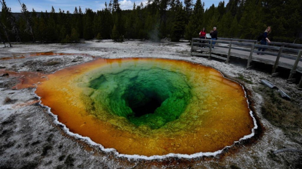
Beautiful, but deadly. How do you keep tourists away?
Commentators seem almost schizophrenic when they discuss these incidents. On one hand, the sentiment is that Disney should have had more signs and barriers, so that park visitors are always aware of potential danger. On the other, too many signs warning of danger at Disney would take away from the “immersive magic” of the setting. Also, as in the case of Yellowstone, too many signs and barriers can desensitize visitors to the very real danger posed by natural elements. These arguments display a key tension in the design of entertainment venues. How do you create a space that encourages safety without irritating guests and egging them on to dangerous stunts? Is there a design system that will keep the child out of the Gorilla cage without provoking feats of bravado from an over-enthusiastic young adult?
Savvy designers should take a page out of a typical daycare’s playbook. Most childcare centers — and homes for that matter — don’t depend on signs to ensure good behavior. Daycare workers know that at best, signs and warnings get ignored, and at worst, they may actually provoke the behavior they’re trying to prevent. Instead, a good childcare space hides dangers whenever possible and tries to make it easy to stay safe when dangerous items must be present. Something as simple as a latch can be enough to foil impulsive behavior and redirect a child away from a dangerous situation.

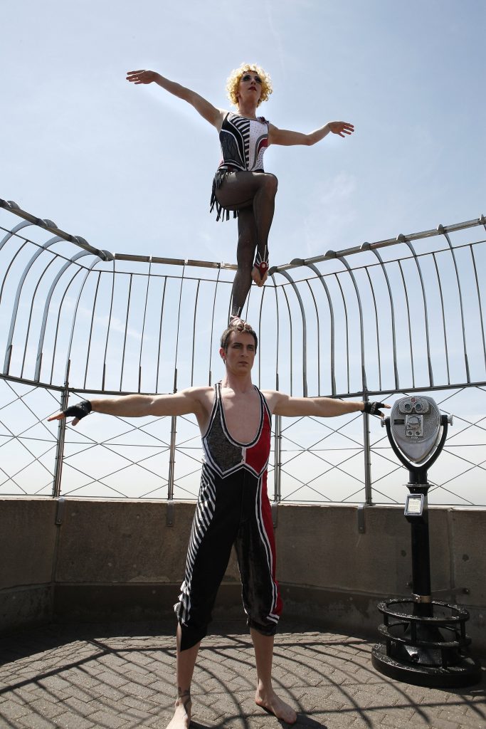
The Empire State Building has some of the safest barriers in the world, but determined visitors can still overcome them.
So how does this relate to adults and children in entertainment venues? The key is to make following the rules easier and more pleasant than courting danger. There’s a balancing act, because each venue has a certain mood, clientele, and goal. A resort wants to maintain the illusion of relaxation and harmony with nature while keeping its visitors from getting too close to the wildlife. Meanwhile, a national park strives to educate visitors and thrill them with natural features, but doesn’t want those thrills to turn deadly.
However, there’s also tension, because many ticketed visitors feel that paying a price for admission entitles them to ignore rules and warnings and endanger themselves, other visitors, and the venue in the process. When designing a venue, the design should go beyond the immersive ambience and answer, “What is the one thing we don’t want our guests to do in this location?” The design of the venue should include subtle elements that make it more pleasant for guests to make the right choices.

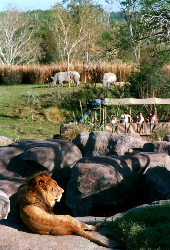
Despite the recent tragedy, Disney is one of the experts at safety design. For instance, at its Kilimanjaro Safaris attraction, imagineers created barriers from natural-looking props so that animals can get tantalizingly close to the cars without endangering guests. By creating encounters that seem to verge on danger but are actually quite safe, the park reduces the chance that an overly adventurous guest might ‘go rogue’ and try to touch the animals. In addition, the barriers mean that even if a guest did leave the vehicle, he’d be unable to actually come into close contact with the animals.
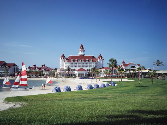
For whatever reason, the lakefront at the Grand Floridian was a chink in the Disney armor. An area of pumice stone or some other landscaping rock between the white sand beach and the water’s edge might have sent the message that the water is for viewing, not wading or swimming. Barefoot guests would naturally be deterred from walking over stone to reach the water’s edge.

Would a border of stone help make the water less inviting?
When signs fail to protect and deter, as was the case at Yellowstone, rangers and park designers may want to try a demonstration or experience instead. Yellowstone already has boardwalks and fences to keep visitors at a safe distance from dangerous features — the problem is that some visitors see those restrictions as challenges, not warnings. A bit of creativity and humor on the part of park staff may help reinforce physical cues. For instance, they could toss a piece of something into the hot spring to demonstrate the potential danger and satisfy the daredevils’ curiosity. A higher budget alternative would be to adapt a theme park model of having a pre-show, wherein an orientation video warns guests of potential dangers in a stylized way (ie, giving a demonstration of what happens to something that comes in contact with the springs).
In some cases, understanding safety goes beyond signage, and is an issue of cultural differences. For instance, at Disney, Floridians knew that a sign saying “No Swimming” meant that the water was probably also unsafe for wading. However, in much of the American Midwest it’s normal to wade in a body of water that’s unsafe for swimming, since dangers tend to be boats, rip currents, or cold temperatures, not dangerous animals. Likewise, Yellowstone has had problems with visitors from other countries who ignore safety warnings to collect water from thermal features. For these visitors, the perceived medicinal value of the water outweighs the posted safety risks.
Like any design decision for a leisure venue, the options for influencing guests to make safe choices depend on location, visitor demographics, and the resources available. When a venue is planned carefully, guest behavior will be influenced without making them feel burdened by rules and security. Safety becomes part of the design backdrop, noticeable enough but part of the overall story of the venue.
Images Courtesy of:


 Sign Up For Our Newsletter


